Boulder County government offices closed Tuesday, Dec. 31 (at noon), and Wednesday, Jan. 1, for the New Year’s holiday.

ARPA Dashboard Tutorial

What is the ARPA Dashboard?

To help communities respond to the coronavirus pandemic, in 2021 the US Congress passed the American Rescue Plan Act or ARPA. Boulder County received over $63 million dollars in ARPA funds. These funds were given to different organizations so they could run programs to help Boulder County residents recover from the coronavirus pandemic. This Dashboard was created to help residents understand where ARPA funds were spent. Learn more about the work Boulder County has done with ARPA funds by visiting the Boulder County ARPA website (this link opens to a new page).

To learn more about how Boulder County strives to ensure everybody has access to our facilities, programs, services, and digital assets, or how to contact us if you feel that you do not have access and would like accommodations, please visit the Boulder County Americans with Disabilities Act and Equal Opportunity Notice (this link opens to a new page).

What are the different parts of the Dashboard and how do I use them?

This Dashboard has different tools that allow you to select the kind of information you want to see. When you do, the rest of the Dashboard will automatically update. Review the list below to understand the different tools or scroll down to read about how the Dashboard can answer specific questions. You can also watch the Dashboard Tutorial Video 1 to learn more about the different parts of the Dashboard and how to use them (this link opens to a new page).


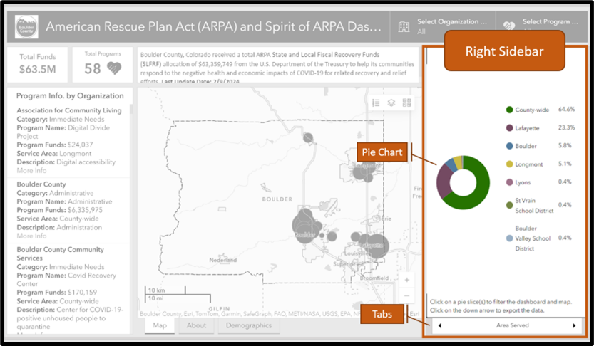
This is where you can find Pie Charts for how ARPA funds were allocated according to Area, Category, or Expenditure.

Right Side Bar explanation showing a pie chart and tabs

  1. Click on a Tab at the bottom to select which type of Pie Chart you want to see.
  2. Click one or more pieces of the Pie Chart to see all the programs and organizations for the type(s) of Area, Category, or Expenditure you selected. When you do, the Program Tiles (Left Sidebar) and Map (Center Window) will automatically update.
  3. To unselect, click the same slice or click anywhere outside the Pie Chart.

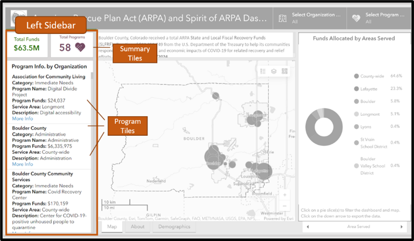
Here you can find Program Tiles with information about programs that received ARPA funds. At the top, the Summary Tiles show the total number of programs and funds for all the Program Tiles below.

Left side bar showing summary tiles and program tiles

  1. Click a piece of any Pie Chart or use the Dropdown Menu to select a specific program or organization. When you do, the Program Tiles and Summary Tiles will automatically update.
  2. Click one or more Program Tiles to see the location(s) on the map and the different Pie Chart types (Right Sidebar). You will know a Program Tile is selected because the tile will have a blue bar on the left.
  3. To unselect, click the same program tile, and the blue bar will disappear.

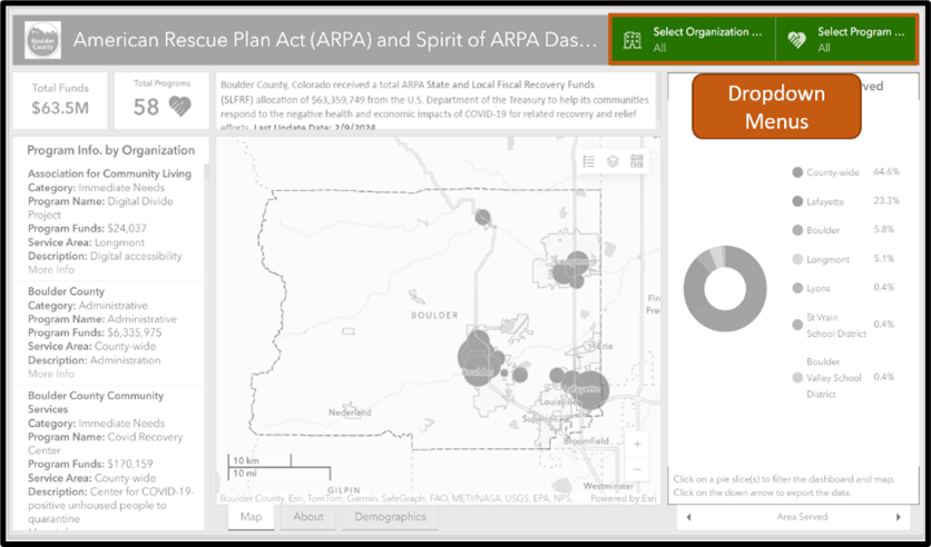
This is where you can see a list of all ARPA organizations and programs. To select one or more programs, scroll down and click on the program name(s) to see their information.

Dropdown menu view with program and organization tabs

  1. Click either of the Dropdown Menus to open the list, and then click whatever program or organization you want to select.
  2. When you do, the Pie Charts (Right Sidebar) and Program Tiles (Left Sidebar) will automatically update to reflect what you selected.
  3. To unselect, click the white “Reset” button at the bottom of the Dropdown Menu.

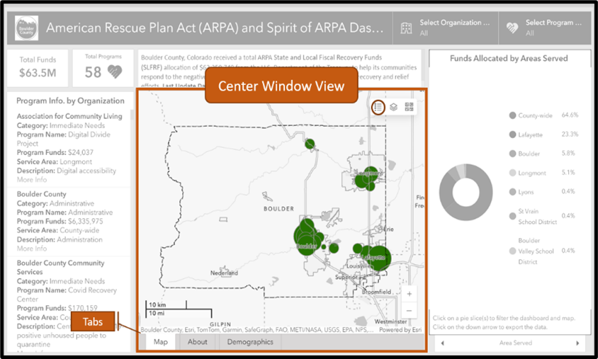
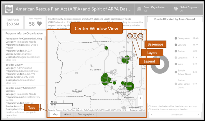
Here you can see overviews of ARPA programs. There is a Map of all ARPA programs and organizations, Demographics of people served by ARPA programs, and an About tab with information about how to use the Dashboard.

Center window view showing a map

  1. Click on a Tab on the bottom of the Center Window to select what kind of summary information you would like to see: Map, About or Demographics.

Here you can see the locations of ARPA funded organizations and programs along with the community characteristics of the places where organizations and programs are located.

Center window view

  1. The Map will automatically update when you select one or more pieces of a Pie Chart (Right Sidebar), a Program Tile (Left Sidebar), or a specific organization or program (Dropdown Menus).
  2. Use the below navigation tools to select additional map characteristics:
  • Legend:Explains what map symbols mean
  • Layers: Selects additional map features
  • Basemaps: Selects different map formats

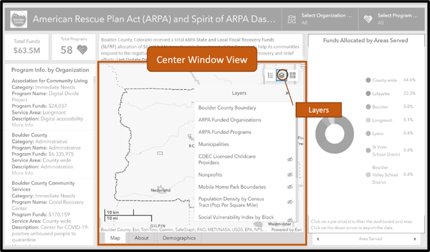
Layers allow you to see additional information about Boulder County municipalities, community resources, and population characteristics. This information can help contextualize where ARPA programs are located and what kinds of communities they serve.

Center window view with explanation of the layers feature

  1. Click on the Layer icon to open the list of Layers.
  2. Click on one or more Layers from the list to see that information on the map.
  3. Deselect the Layer by clicking on it again.

In the top right-hand corner of each Dashboard section, there is an Expand tool you can use to make that section full-screen. To reduce the section back to its original size, click on the same expand button.

Close-up view of the expand view tool

In the bottom right-hand corner of the dashboard map, there is a zoom button you can use to zoom in or out of the map. Use the right and left arrows of your keyboard to pan the map.

Zoom button with plus and minus buttons

If you have selected different elements from the Dashboard and want to return to the original view that shows all programs and organizations, you can do the following:

  • Dropdown Menu: Click the white “Reset” button at the bottom of the Dropdown Menu. The Dropdown Menus are located at the top righthand of the screen.
  • Pie Charts: Click the same slice(s) you previously selected or click anywhere outside the Pie Chart.
  • Program Tiles: Click all the Program Tiles that have blue bars so no Tiles have blue bars.

All Dashboard: If you still cannot return to the Home Screen, try refreshing the page, clearing your cache, or using a different browser.

What questions can the Dashboard answer?

The below list explores just a few of the questions the Dashboard can answer. Using the Dashboard tools above to specify what kind of information you want to see will allow you to answer even more questions. You can also watch the Dashboard Tutorial Video 2 to learn more about the different parts of the Dashboard and how to use them (this link opens to a new page).
The ARPA Dashboard shows how much ARPA money was spent on different Areas, Categories, and Expenditures. To find out how much money was spent on each, follow these steps:

  • Step 1: Go to the Right Sidebar where there are Pie Charts. (See tutorial section “Right Sidebar” for more information about these tools.)
  • Step 2: Click one of the Tabs at the bottom to select the type of information you want to see.
  • Step 3: Hover over any piece of the Pie Chart to see: (1) The total amount of funds spent on that piece, (2) The percentage of total ARPA funds that went toward that piece.

Learn More

What are Categories? In 2021, community members, county employees, and experts worked together to identify the most urgent needs of Boulder County residents. They identified four Categories of community needs: Housing Affordability, Economic Challenges, Mental Health and Social Resilience, and Immediate Needs. To learn more about this Community Engagement and Planning process, visit the Boulder County ARPA webpage (this link opens to a new page).
What are Expenditures? The United States Department of Treasury has categories for the kind of community need the ARPA funds serve. Those are called Expenditure categories and they are created by the federal government.

The ARPA Dashboard shows which organizations and programs received ARPA funds according to different Areas, Categories, and Expenditures. To find out which organizations and programs received ARPA funds in different types of Areas, Categories, and Expenditures, follow these steps:

  • Step 1: Go to the Right Sidebar where there are Pie Charts. (See tutorial section “Right Sidebar” for more information about these tools.)
  • Step 2: Click one of the Tabs at the bottom to select the type of information you want to see.
  • Step 3: Click one or more pieces of the Pie Cart.

  • The Dashboard Map will automatically update to show you the locations of the programs for the type of Area, Category, or Expenditure you selected from the Pie Chart.
  • The Left Sidebar will automatically update to show you a list of all the organizations and programs for the type of Area, Category, or Expenditure you selected from the Pie Chart.

ARPA funds were distributed to organizations, and the organizations implemented different programs to help Boulder County residents recover from the COVID-19 pandemic. To find out how much money was given to each organization or program, the areas they serve, the funding categories they belong to, and their location, follow these steps:

  • Step 1: Go to the Dropdown Menus in the upper righthand corner of the Dashboard.
  • Step 2: Click one of the Dropdown Menus to select one or more organizations or programs. The Dashboard will automatically update to show you the information for what you selected. That information will be available on the Map, the Left Sidebar, and the Righ Sidebar.

ARPA funds were intended to serve all Boulder County residents with a special focus on the people who were most impacted by the COVID-19 pandemic. The Map in the Center Window View shows the location of all ARPA funded organizations and programs. It also shows the characteristics of the places those organizations and programs are located. Characteristics include municipal and mobile home park boundaries, community resources (childcare centers, nonprofits), and population information (density, Social Vulnerability Index). To see these additional characteristics when using the Map, follow these steps:

  • Step 1: Go to the Center Window View and click the Tab that says Map.
  • Step 2: Click on the Layers icon in the upper righthand corner. The Layers icon looks like this:

Layers icon

  • Step 3: Select one or more Layers to see those characteristics on the Map .

Learn More

What is the Social Vulnerability Index? Every community must prepare for and respond to hazardous events. The degree to which a community exhibits certain social conditions like poverty, crowded households, or low income may affect a community’s ability to prevent human suffering and financial loss in the event of a disaster. These factors describe a community’s social vulnerability.
What are the Social Vulnerability Index Themes? Communities can be vulnerable in different ways, so the Social Vulnerability Index is organized by four themes: Socioeconomic, Household Composition & Disability, Minority & Language, and Housing & Transportation. Exploring the specific ways a community is vulnerable helps us understand each community’s unique characteristics and needs.
What are the Social Vulnerability Index Percentile Rankings? U.S. Census data from 16 social factors were used to determine social vulnerability of every block group in Boulder County. A percentile ranking method was used to derive the block group score. A percentile ranking represents the proportion of the block groups in Boulder County that are equal to or lower than a block group of interest in terms of social vulnerability. Possible scores range from 0 (lowest vulnerability) to 1 (highest vulnerability). For example, a score of 0.85 signifies that 85% of the block groups in Boulder County are less vulnerable than the selected block group, and 15% of block groups in Boulder County are more vulnerable. Rankings are classified using quartiles (0 to .2500, .2501 to .5000, .5001 to .7501, and .7501 to 1).

The ARPA Dashboard Map (Center Window View) allows users to select different Basemaps. Different Basemaps show different features, like roads and topography, and different formats, like dark view and satellite view. Selecting Basemaps allows you to customize the Map according to the type of information you want to see or your visual preferences. To change Basemaps, follow these steps:

  • Step 1: Map (Center Window View).
  • Step 2: Click on the Basemap icon in the upper righthand corner. The Basemap icon looks like this:Basemap icon
  • Step 3: Select a Basemap to update the Map.